

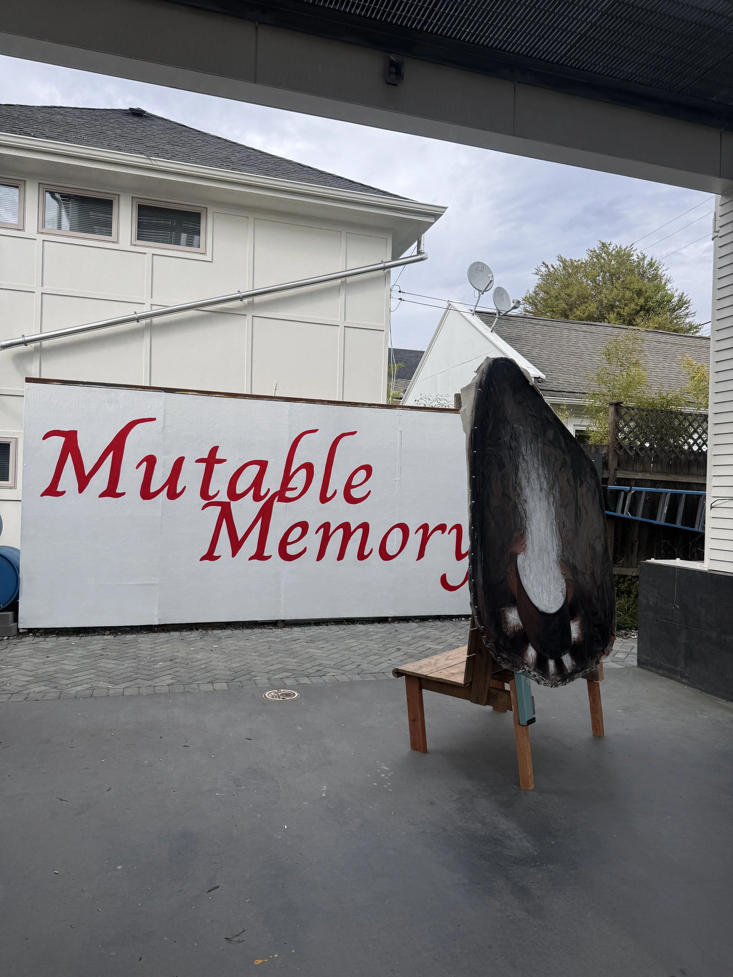
Non-Linear Lineages at Mini Mart City Park
A short reflection on a two-person exhibit at Mini Mart City Park of Rachel Dorsey and Naomi Kasumi, Mutable Memory.
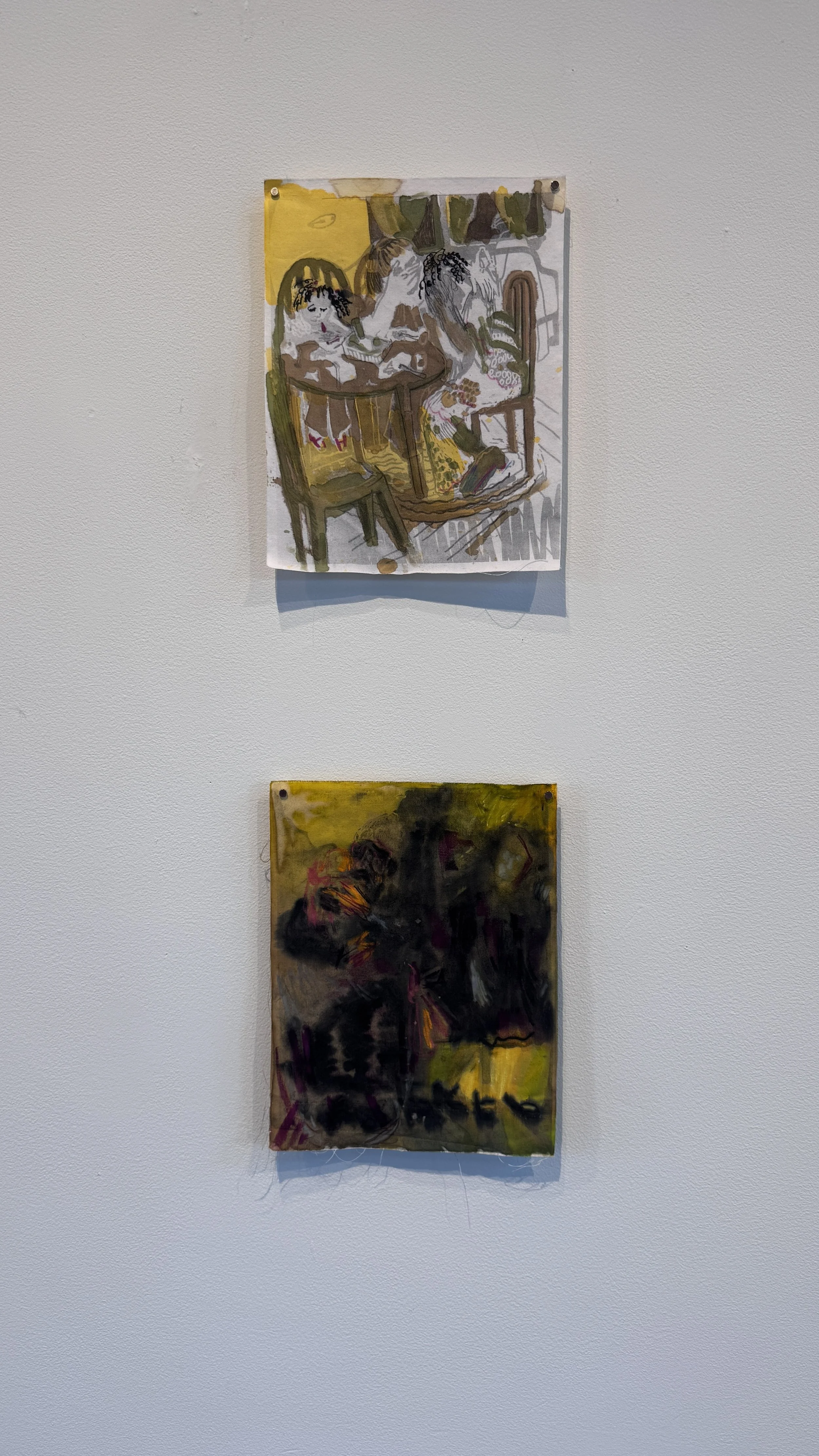
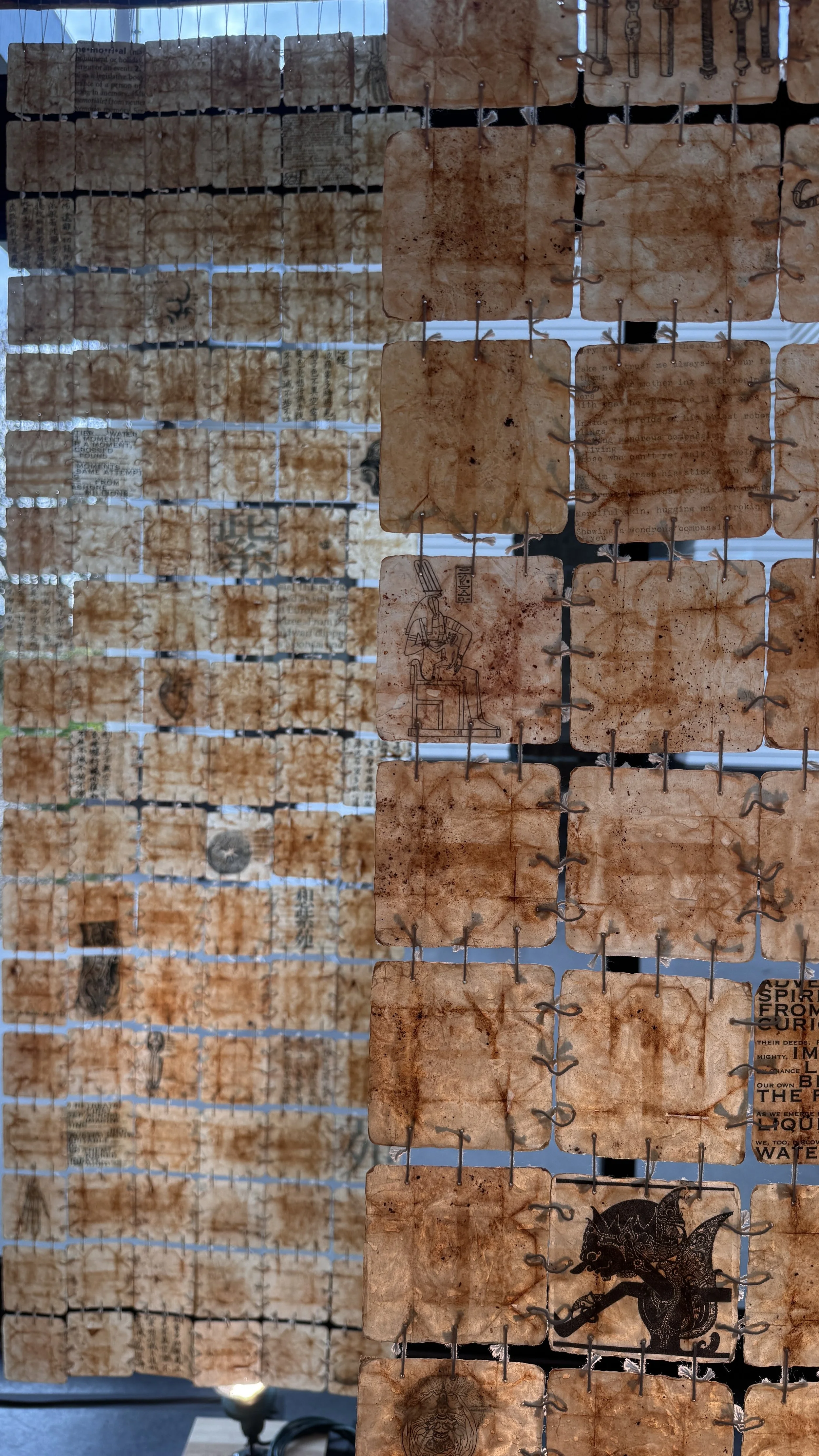
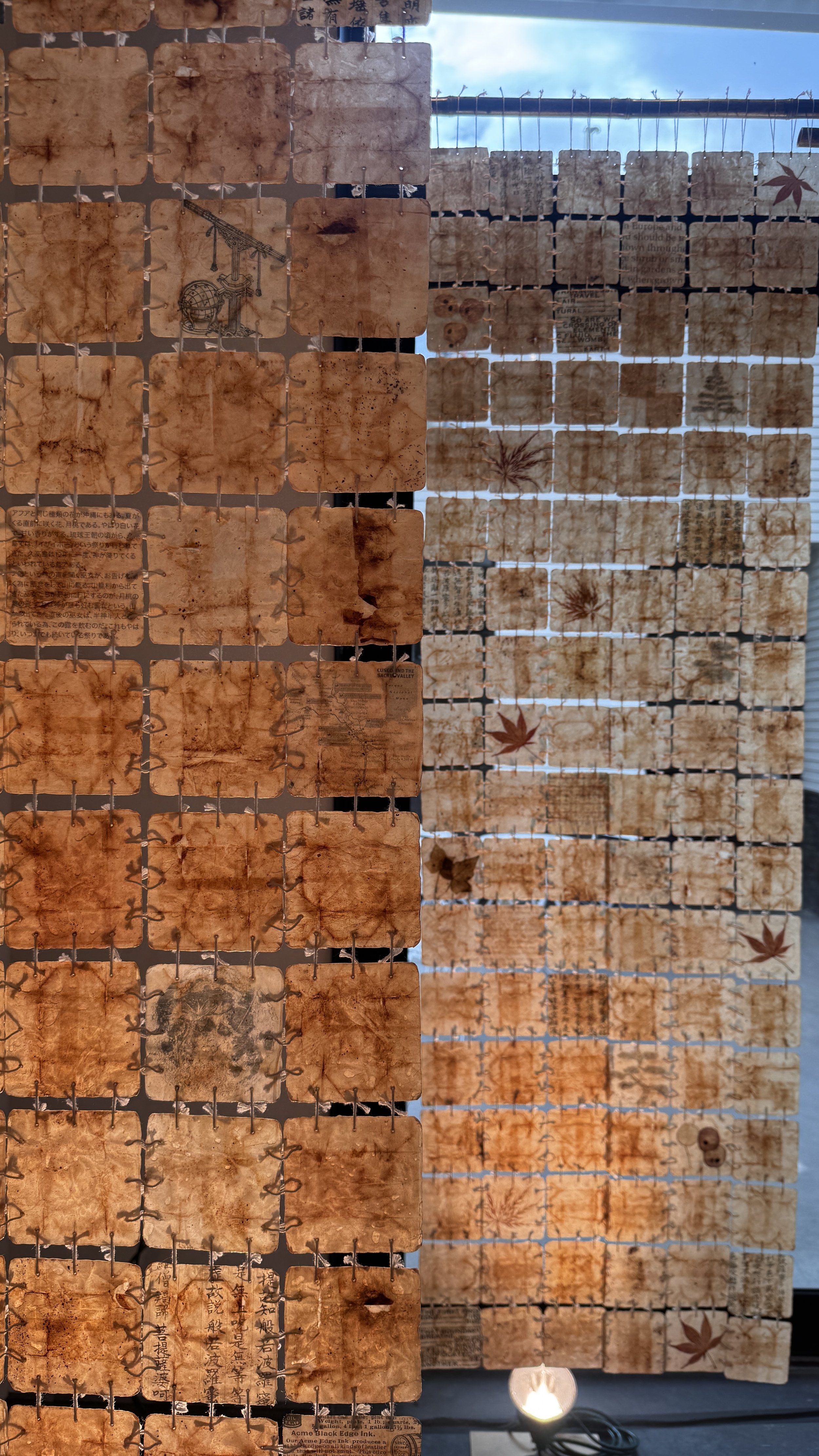
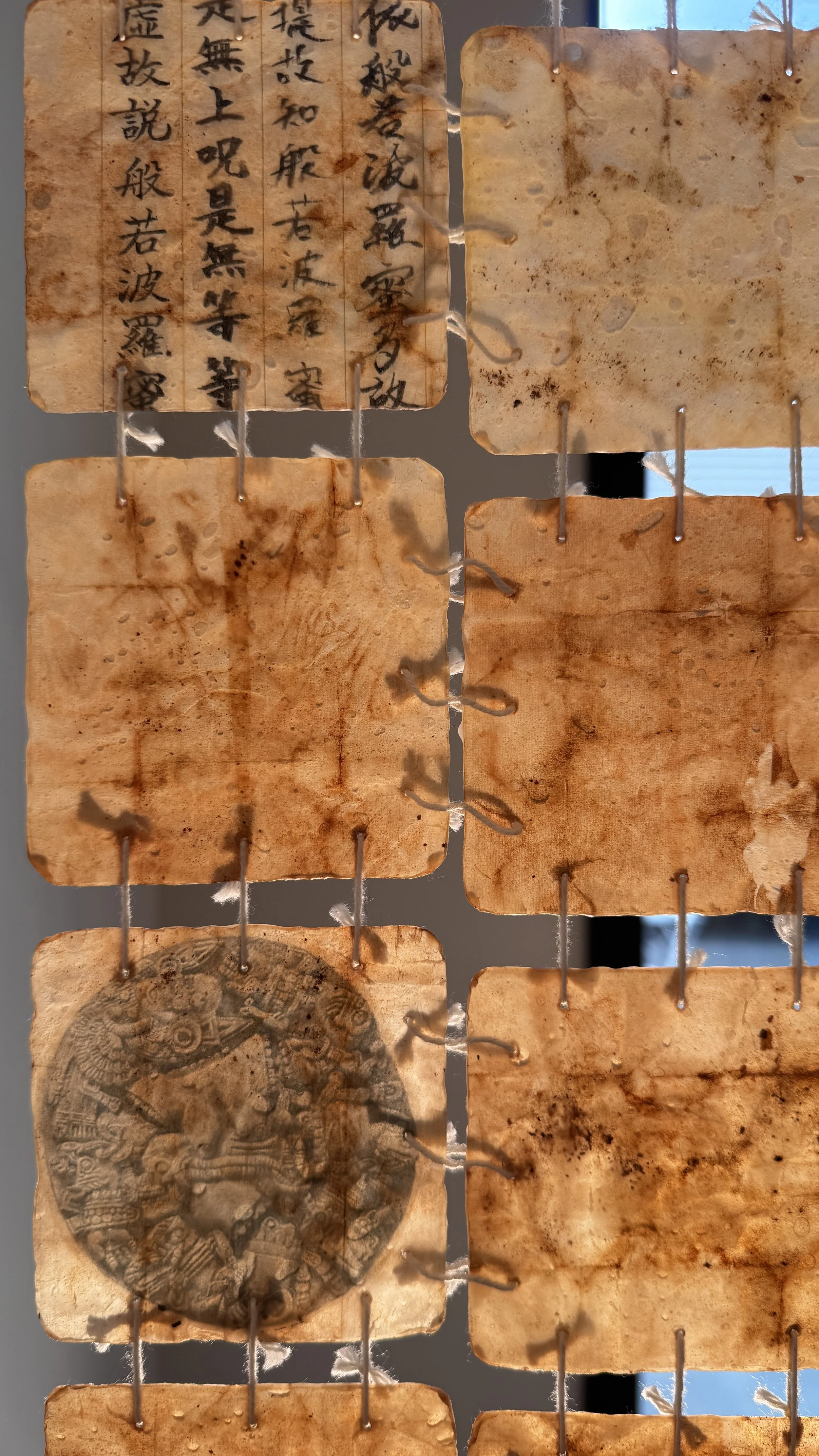
Naomi Kasumi, MEM: memory • memorial no. 7. Encaustic cards which contain Japanese sutra calligraphy, digital images, Xerox images, personal hand-writing, maple leaves, plants, and butterfly wings, bamboo, cotton string.
It is purely by chance I am writing about family lineages and mentioning the Behnke Gallery in back to back posts.The examinations of interpersonal relationships and family lineages create an entirely different scene in comparison to my last encounter with the subject (at Erin Elyse Burns’ Sabbatical exhibition) in this two-person exhibition of Naomi Kasumi and Rachel Dorsey. Brought together by the curatorial team at Mini Mart City Park and lead by Alissa Dymally Williams, Mutable Memory was a raw and meticulous representation of grappling with the cycles of life through material.
Detail of MEM: memory • memorial no. 7.
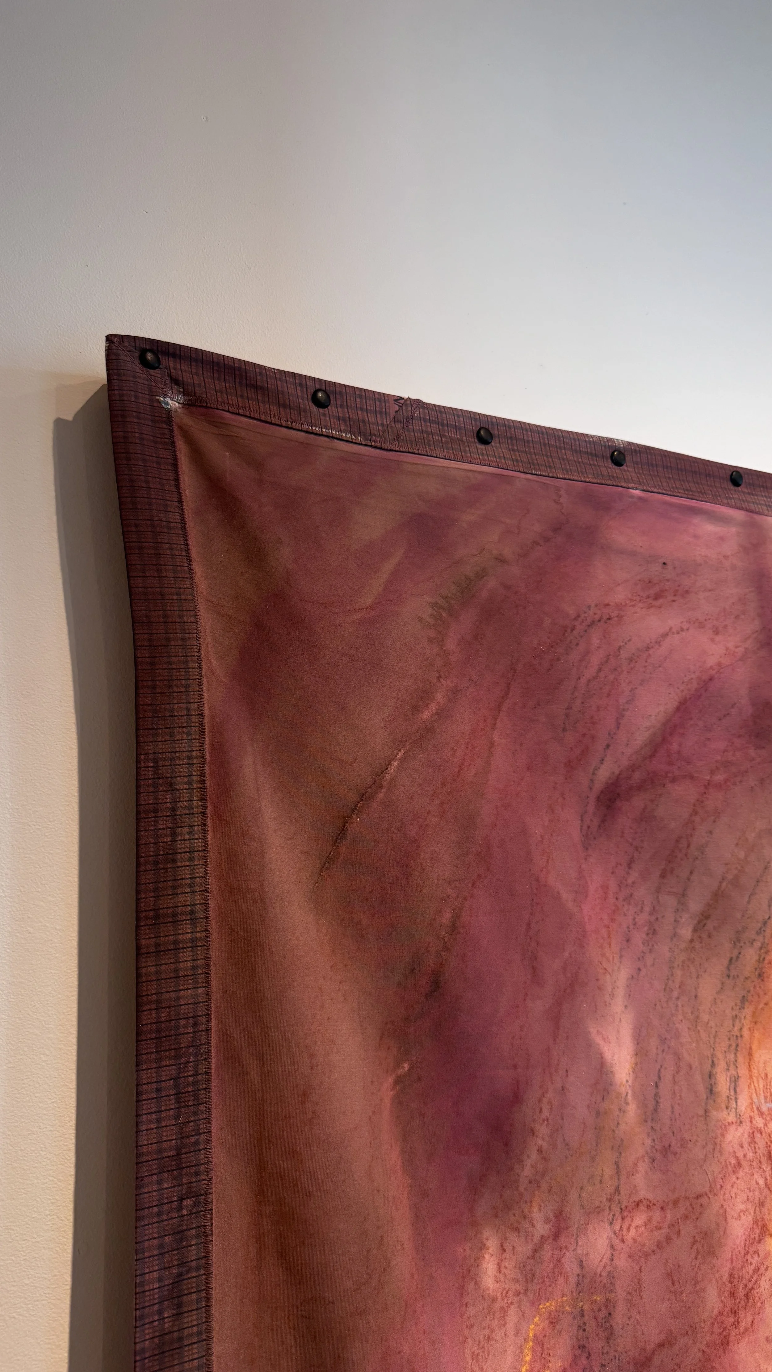
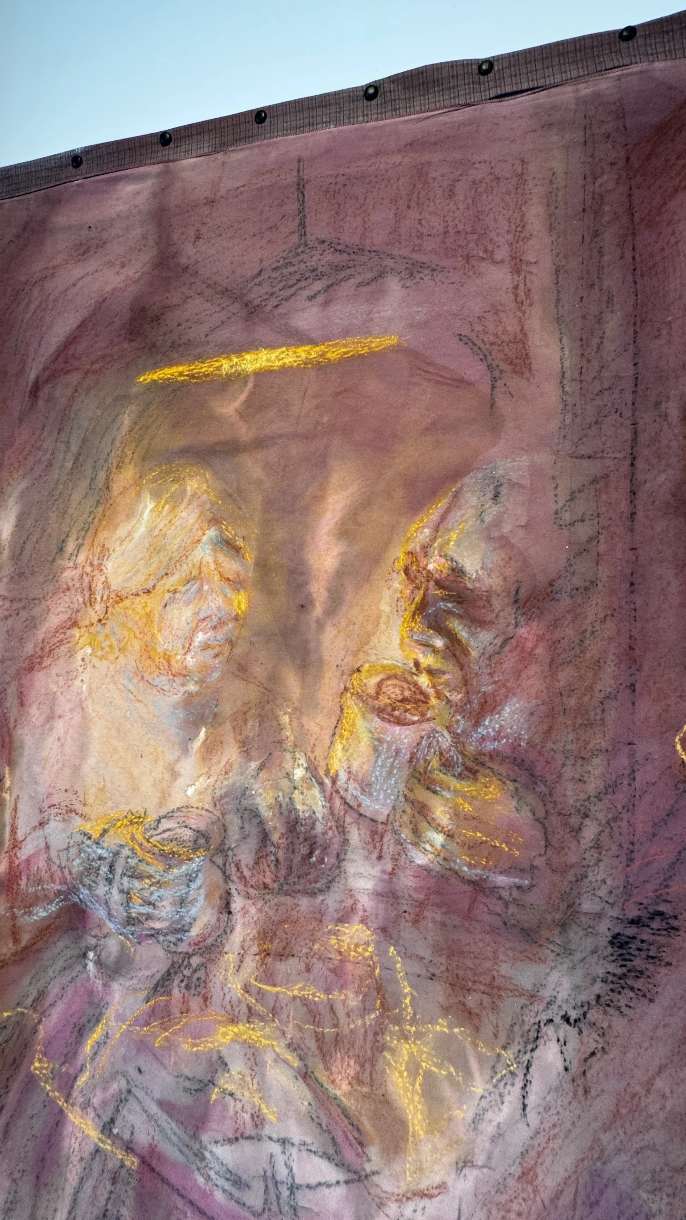
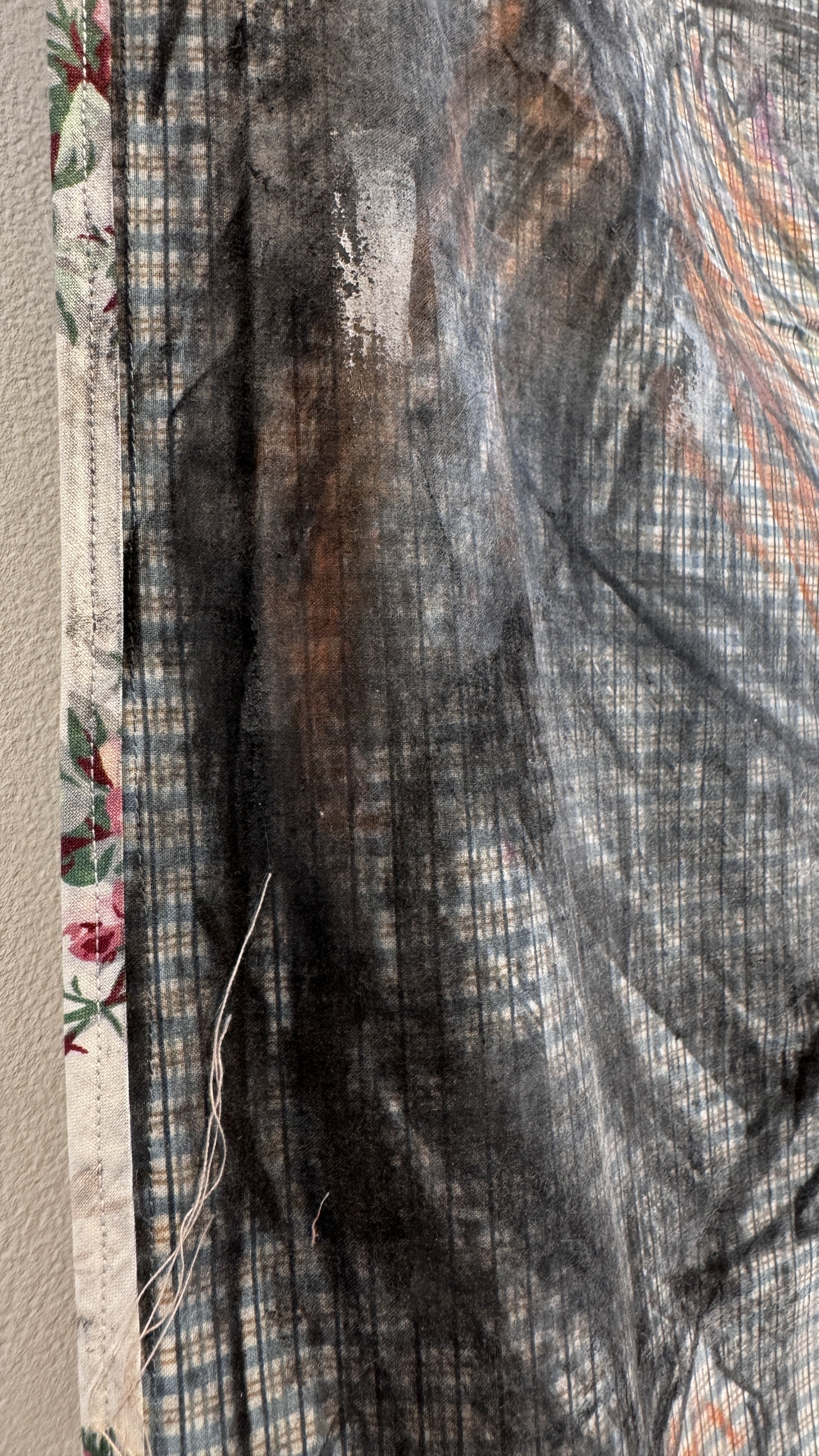
These glowing, membrane-like tapestries suspended at the back of the gallery drew me in immediately from where I entered. Williams tells me she encountered them on view at the Behnke Gallery in a group show and just had to show them. I found a reference online as well of these works on view at Woman Made Gallery in Chicago. There are actually nine panels that comprise this work, and it has previously been shown completely shrouded in darkness, the individually lit panels created the light in the room like a womb or a cave lit up by flame. I learn that this is a letter to Kasumi’s unborn child, stories she would have told her of the moon and butterflies, leaves and gods. From its delicate details and sentimentality to its life-size scale, it bore the most presence in the room. Kasumi shares with Mini Mart, "Through installation and book art, I found a way to transform concealed emotions into public expression—sharing truth as a form of catharsis." The repetition within the work can be physically seen in each of the works on view. They exhibit the ways in which tending to emotions is cyclical, metaphorically and physically employing the act of mending.
Besides the repetition, the light which passes through this piece MEM: memory • memorial no. 7 defined the mood in which I received all of the works. The act of passing was consistent in the show: passing through, down, by, around, away, etc. The presence of this first work I fixated on is quite uplifted in this corner of the gallery, flooded with natural light and surrounded by warm wood accents. It is the perfect counter to the opposite corner where a grounded, heavy and darker drawing by Rachel Dorsey is pinned up.
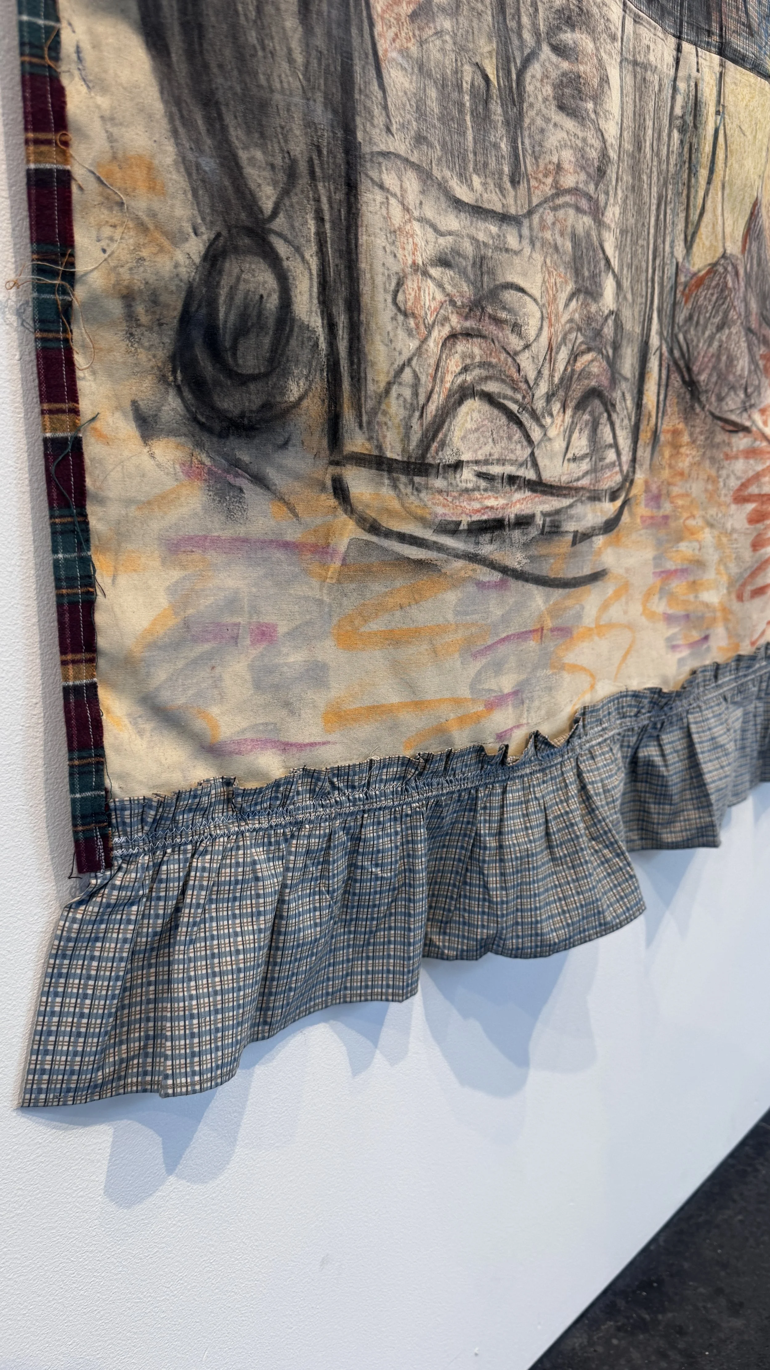
Rachel Dorsey, Lessons in Physics (Newton's Cradle - for my grandfather), 2025. Charcoal, conte crayon, walnut ink, turmeric ink, acrylic ink, extra heavy molding paste, upholstery thread, linen, wool scraps, other found fabric, butterfly clips.
This work embraces a clumsiness I imagine is a result of moving loose material over loose fabric, letting washes bleed and soak with little controllability. Dark outlines of feet and hands materialize out of the other non-descript lumps. This piecemeal and asymmetrical quilt blends and embeds with the surface of the drawing. Its weight is emphasized by the taught threads holding it up. Williams tells me the substrate of the drawing, the fabricated quilts, were passed through the artist’s family onto her; a family of factory workers and caretakers.
Rachel Dorsey, Shift Change. Charcoal, conte crayon, natural dyes (black bean, madder, black tea, rosemary, indigo), walnut ink, turmeric ink, acrylic ink, oil stick, extra heavy molding paste, fabric scraps (hand-me-down table linens), wool scraps, darning thread, drop cloth patches.
The works are not elegant; gritty and feverous marks loosely reveal images competing with an already determined color palette of the fabrics. One of the works, Receiving Line, has a rather clunky plaid skirt adorning its bottom border. Sometime I find the fabric and the drawing/painting happening atop it are a bit at odds with one another. Yet, they do capture a ruggedness and sought-after comfort I find compelling in the context of the origins of the fabrics. Williams compares a neighboring drawing by Dorsey, Shift Change, to The Potato Eaters by Vincent Van Gogh. The figures gather and bunch and hold each other up, sharing space on an object characterized by its ability to share comfort and warmth.
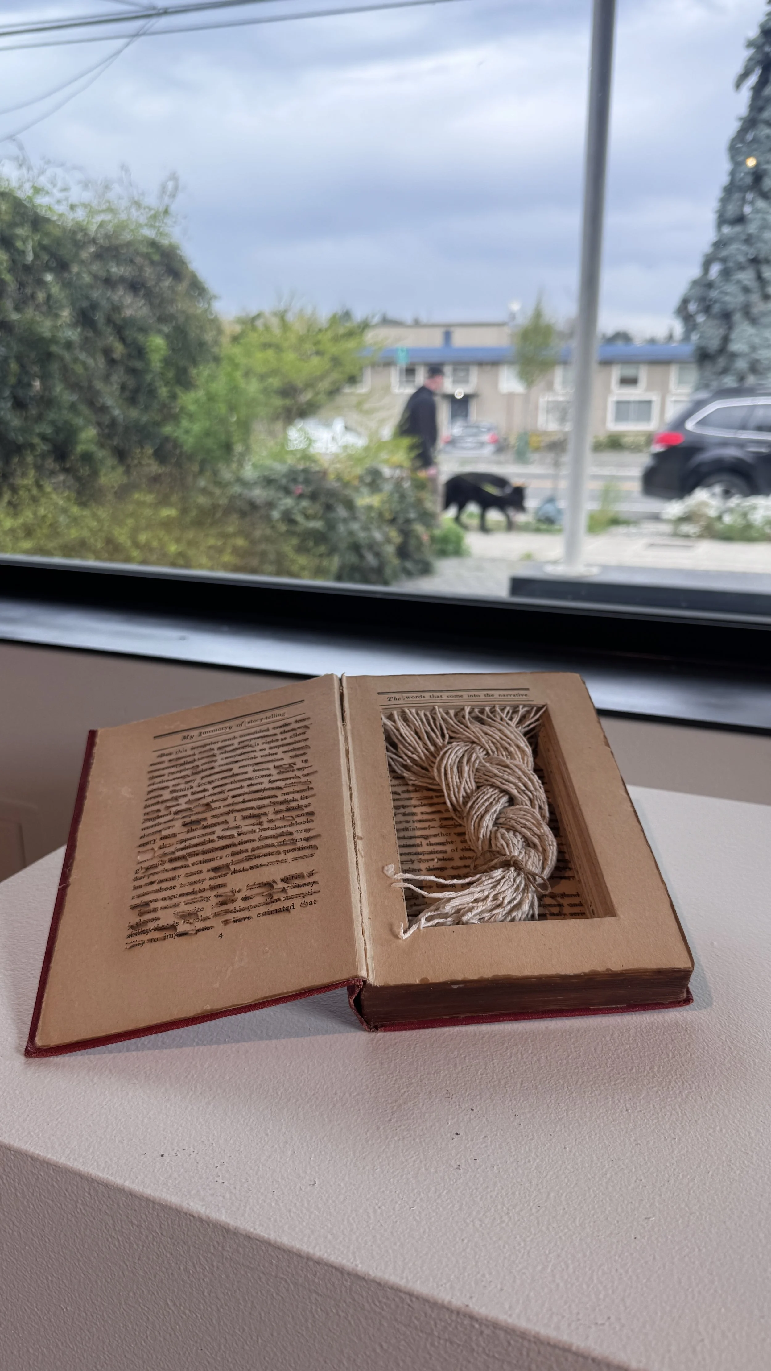
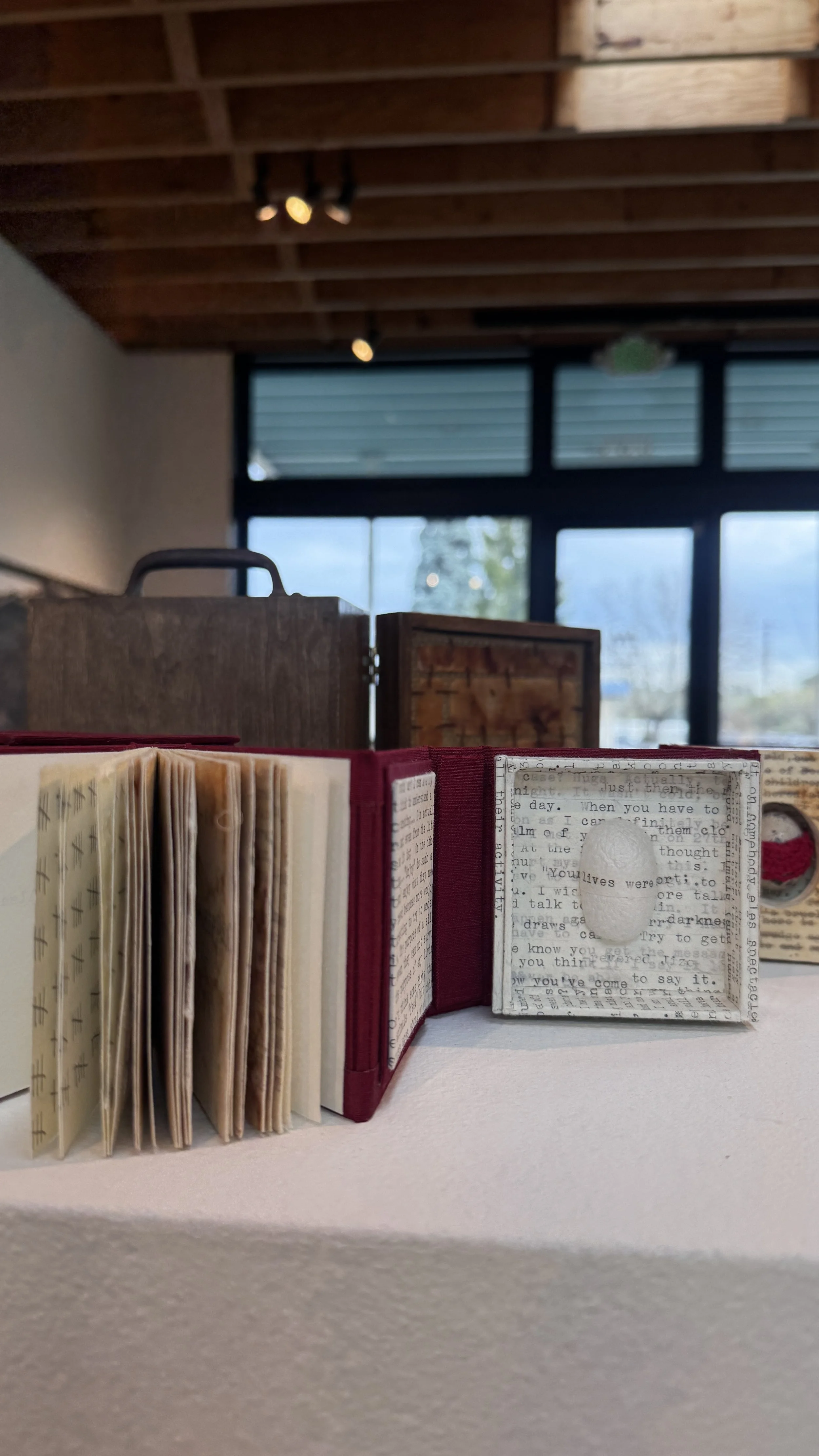
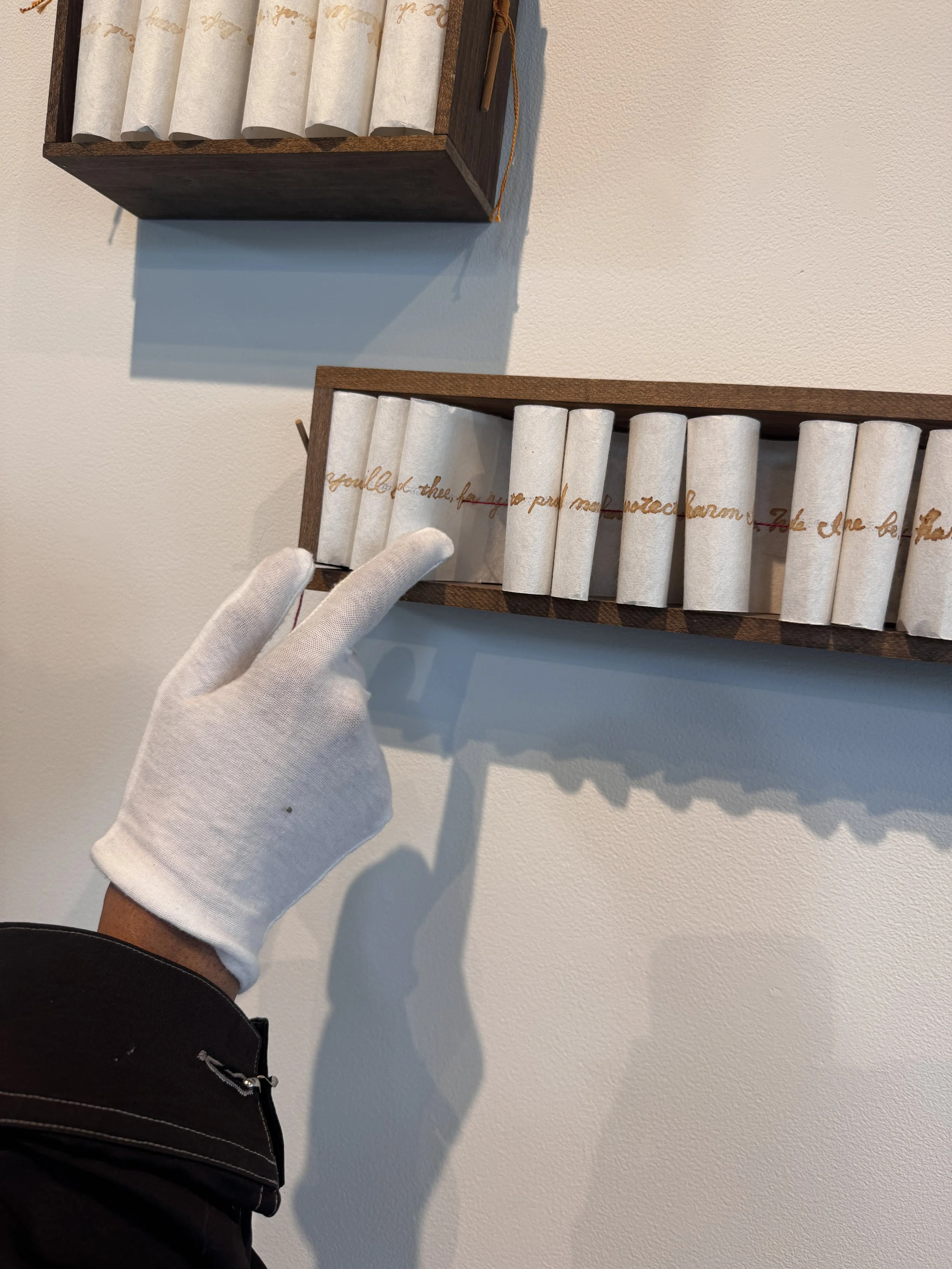
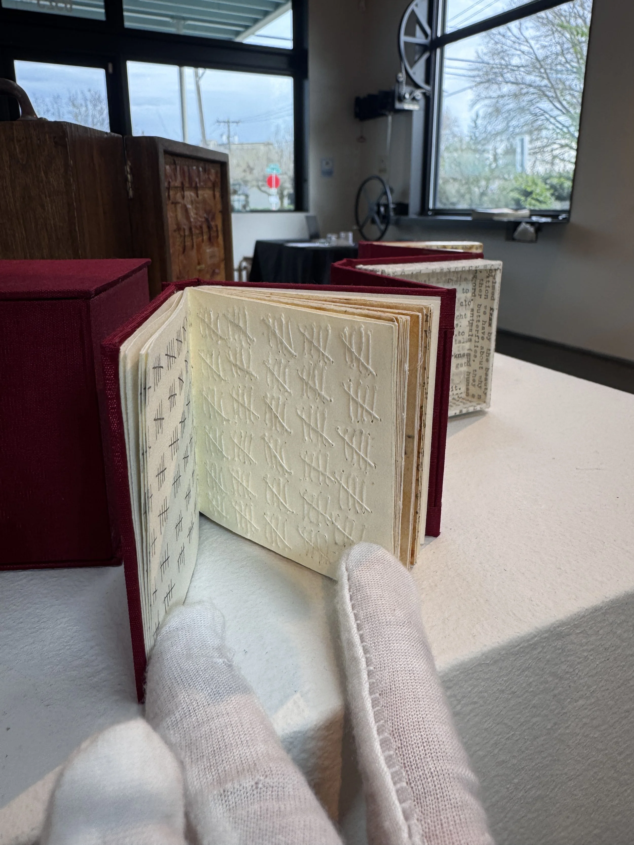
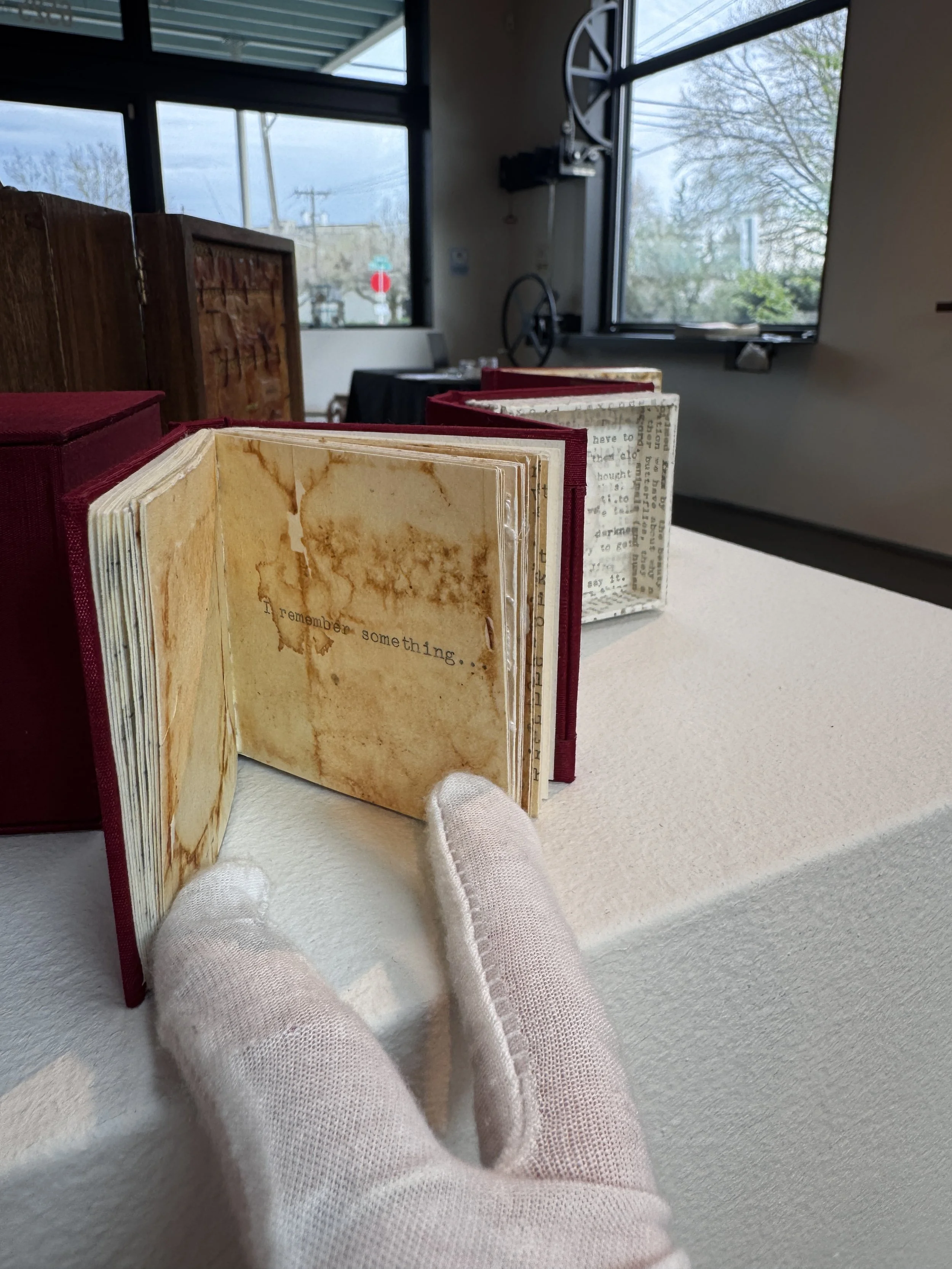
Between these two large works by Dorsey are some curious little objects by Kasumi that I am invited to prod at with white gloves presented to me by Williams. We talk about the detail-oriented process of book making and how Kasumi creates complex and poetic experiences of text. Truthfully, I don’t try to read them. I let the folded in secrets remain what the are. I reveal the phrase “to be protected…” and encounter a thread running through the centers of the folds of the long script contained within the small box, literally creating a through-line. Still, the folding of the paper breaks the linearity in which we both read text and experience time. I contemplated heavily on the idea of ‘folding’ and found myself later researching— well, rather I was spiraling down a rabbit hole— on the Fold Theory, if folds exist in time, quantum mechanics, and the puzzlement of consciousness. Ironically, I went down that hole before knowing the title of an aforementioned work by Dorsey, Lessons in Physics (Newton's Cradle - for my grandfather). After a dizzying experience of trying to understand if folds actually exist in time I eventually came across an a statement in an article that stuck with me, “our consciousness, being an information structure, processes the information that we absorb from our bodies and our environment.”
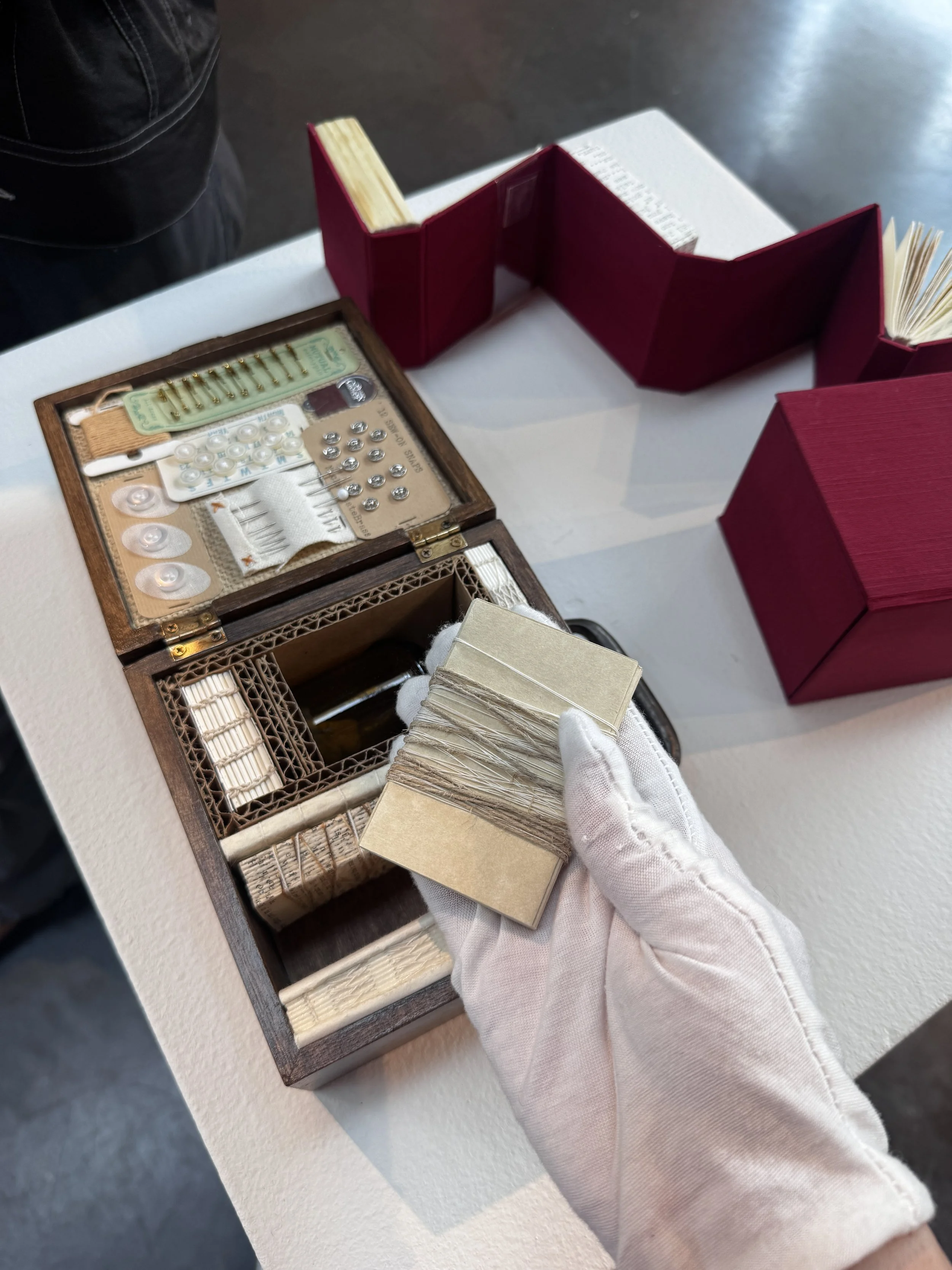
Partial view of Naomi Kasumi, Secret Collection #6 Forma Magiche, 2013.Mixed media (Japanese washi paper, wood, colored thread, Bamboo stick, ink, invisible ink, fire).
Partial view of Naomi Kasumi, Secret Collection #6 Forma Magiche, 2013.Mixed media (Japanese washi paper, wood, colored thread, Bamboo stick, ink, invisible ink, fire).
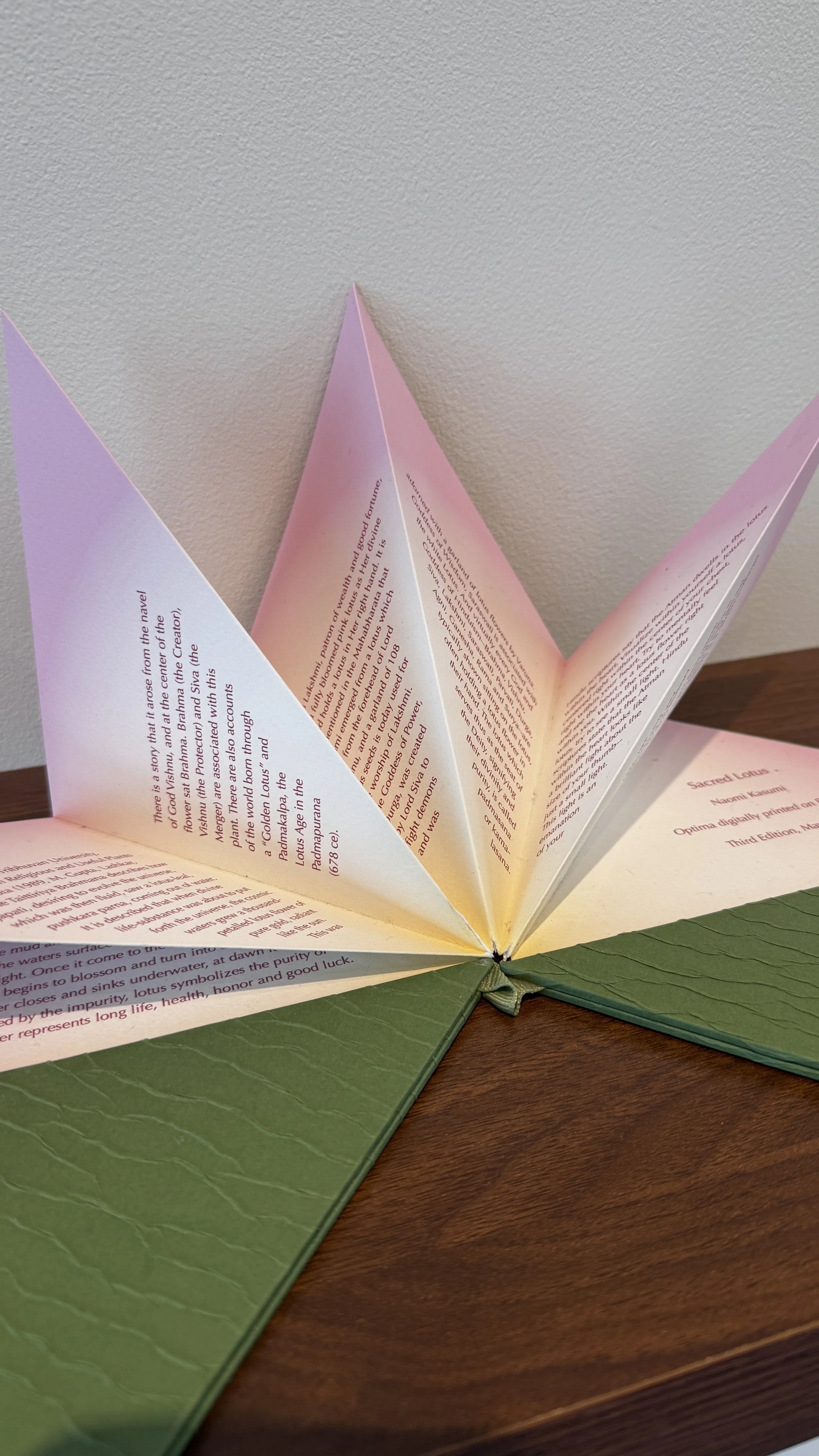
I find these works in this cohesive curation of meticulous items do reflect the sentiment of that definition of consciousness. These artists provide a grounded view of transcendence, connecting familiar material and matter to their own family history and stories, of loved ones passed away or only imagined. Dorsey tells Mini Mart, "Throughout the process, I felt like the editor of an anthology, pulling together a tapestry of short stories responding to a question: how, in big and small ways, do we care for one another?" Amongst the artworks is a book by Kasumi that resembles a Lotus flower and is written in memory of her late father. It is the only object in the show that has a pristineness and bright green and pink color palette that sets it apart from the otherwise weathered works.
Rachel Dorsey, Gather/come as you are, 2024. Charcoal, conte crayon, and molding paste on canvas stretched over custom wood support structure. Wood fabrication by James William Blake.
The wonky large-scale works by dorsey and the finely crafted memory collections by Kasumi make me think about all the items I carry and live with that possess the same sentimentality. What do we do with it all? How do we compartmentalize the feelings and set them free? In the midst of this line of questioning, I keep coming back to the act of passing and how energy transfers. And yes, I am thinking about Newton’s Law again —besides that, there is also the energy possessed in the objects passed through generations, unbound by the laws of physics. The show itself does successfully “challenge the way [I] call on memory and stow away sentimentality,” as stated by Curator Williams.
I look forward to seeing what’s next for these artists as they continue to hone their use of materials and find nuance in storytelling. There is much more to discover in the practice of accessing material and using its potential energy to transform it into something quite visceral; a detail I will take into my own studio.
Here are more images taken by me upon visitation of the exhibition.
Mutable Memory, was on view at Mini Mart City Park from April 4 – 26, 2026.
Upcoming exhibitions from Mini Mart City Park can be found here.

Fixated on a Spectrum
Christopher Derek Bruno turns permanence out of the ephemeral in his exhibition, if/then/yes/and, at Greg Kucera Gallery. He crystallizes momentary sensations, like a sunset, into permanent art objects.
Christopher Derek Bruno turns permanence out of the ephemeral in his exhibition, if/then/yes/and, at Greg Kucera Gallery. He crystallizes momentary sensations, like a sunset, into permanent art objects.

Installation view of if/the/yes/and at Greg Kucera Gallery. Image by the author.
The formulaic title told me most I needed to know about the attitude of the show: I expected precision. You know, coding? In the simplest way, you can use this formula in excel spreadsheets. I know Bruno’s work to be invested in color fields, creating immersive experiences through fabrication and programmed machines. You might have seen his installation at the Railspur Building in Pioneer Square: an exterior staircase encased in glass with a transparent rainbow filling the length of the space; each landing a new color experience in which to view the surrounding streets through. My personal favorite project of his occupied the Railspur building as well, a whole floor dedicated to an installation of gradient printed tents at Forest for the Trees in 2023, calling attention to the homelessness experienced in the PNW (and all sales of work donated to local mutual aid organizations helping the homeless).
This investigation of color and space continues in his newest body of work at Greg Kucera Gallery. It is a habit for me to get as close as possible to the work, and the Moiré patterns vibrating across the surfaces of Bruno’s works insinuated his fine details. I immediately thought of Sol Lewitt’s Wall Drawings, specifically one I experienced at Dia:Beacon in 2017. Lewitt’s work is actually just a plan on paper when a Museum acquires it; an entrusted team of draftsmen execute the drawing on the wall. Long lines in just three colors, red, yellow, and blue, extend for tens of feet, colors start and stop mid-stroke and change directions to create a hazy grid of squares in different hues. Walking up to it, the lines become clearer. Both Lewitt and Bruno rushed a memory to the front of my mind, of pressing my face into the tube TV I grew up with. I would slowly approach the screen and watch the color disintegrate into tiny dancing pixels, completely entranced by the visual noise wrapped around my eyeball until it became uncomfortable, or a parent pried me away from the screen.
Sol Lewitt at Dia Beacon.
Detail of Sol Lewitt at Dia Beacon.
Leaning in close to some of Bruno’s works, an array of plus signs burst in front of my eyes. Some disintegrated and pixelated into tiny squares. I wish the labels told me the approximate quantity of pixels composing the gradients. The tantalizing realization was finding it is also just three simple colors that are utilized: red, yellow, blue. In some instances, the edges of the mark created by the latex printer can be seen. Other times, they are entirely obliterated.

Detail of PLANAR STUDY : 1 (double), 2025. All photos provided by the author.
Bruno’s works are classified into two separate categories: PLANAR STUDY and INCIDENTAL WORK. The Planar Studies are all leaning acrylic panels, one has another slid behind it. I was looking up the materials in the middle of the gallery to understand how these were assembled. The pixels look like they are trapped between multiple layers of the acrylic. In my close and careful inspection, removing my fluorescent orange hat reflecting back to me to see clearer, I imagine it is a PET film backing to the panel (I had to look up PET film).

PLANAR STUDY : 1 (double), 2025 Latex print, PET film, acrylic, and acrylic-urethane on panel
72 x 44 x 4 inches.
Whether I am wrong or right, Bruno’s work executes the same wild spectrum of blue to red to yellow in a transparent manner, the pattern cascades onto the wall behind the works. In the case of INCIDENTAL WORK, the colors blend between multiple panels aligned inches apart.

INCIDENTAL WORK : 5, 2025 Latex print, PET film, acrylic, and acrylic-urethane on panel
37 x 37 x 4 inches.
While the spectrum is expansive to include greens and oranges, I did wonder, what if there were a purple present that made me say “that shade is everything?” Or, a real campy Magenta. I find contentment settling for these colors, and I am living for the execution of it. Writing this down I joke I am writing like this because it is Pride month.

INCIDENTAL WORK : 7, 2025 Latex print, PET film, acrylic, and acrylic-urethane on panel
11 x 56 x 8 inches.
Speaking of gay! The execution of the work is as methodical as neighboring artist Anthony White. White’s show Somethin’ Somethin’ in the front gallery of Greg Kucera houses his ornate and meticulously fabricated “paintings” made up of PLA (3-D plastic laid down line by line by White’s hand, through a 3-D printing pen). That meticulousness is harnessed in Bruno’s work in a much more meditative sense. Between the excessive iconography in White’s work, and Bruno’s layered processes, I was basically googling everything. The serenity of colors in if/then/yes/and became a reprieve from the cacophony of Somethin’ Somethin’.

Detail of CORDIAL COMPLIANCE, 2025 PLA on panel 60 x 48 inches.

CORDIAL COMPLIANCE, 2025 PLA on panel 60 x 48 inches.
Still, poetic parallels radiate between the two; they ride a wave of vibrancy and transcendence at opposite ends of a spectrum. White’s hand spun PLA “paintings” are as stringent as the more machine reliant works by Bruno. The intervention of the hand is a great point of contrast in the execution of the works—the more technology used the less presence the hand has. I’ve come back full circle to Lewitt’s Wall Drawings, who practically invented an ideology where “the hand” which executes the work doesn’t have to belong to the artist.
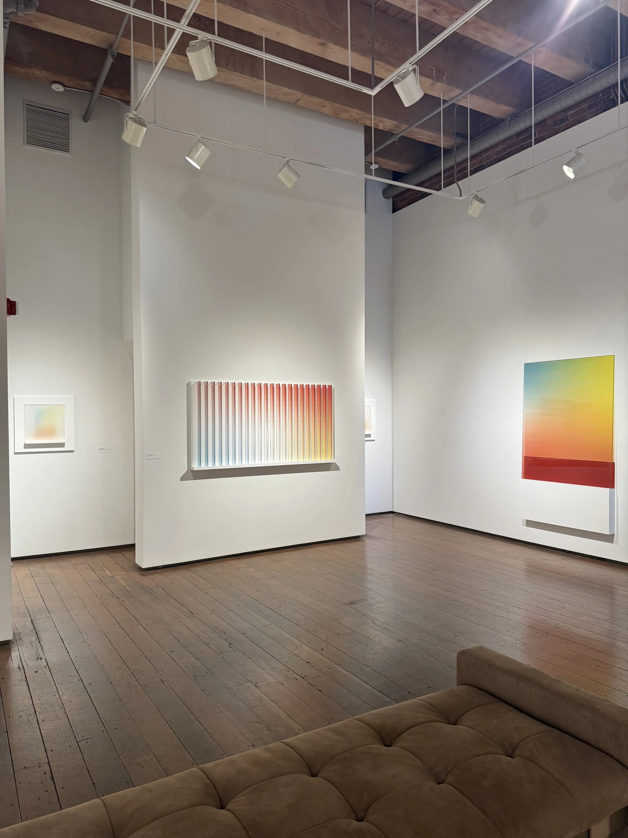
Installation shot of Bruno’s work at Greg Kucera Gallery.
Bruno’s work is truly unlike anything I’ve experienced once I started unpacking it all, analyzing material and processes to the best of my ability. There are moments of simplicity in the aesthetics that come across as monotonous —the color, the rectangularity— yet the craft is undeniably concise and meaningful. Certainly, there is an importance to the chosen palette that is familiar to printing processes, and are in a perfect triad relationship at equal distances from each other on the color wheel. While ambitious, the careful presentation is quite tame. The INCIDENTAL WORK are the most sculptural, yet restricted to the wall. The work is at risk at becoming empty to the less curious.
As material studies, these works are completely masterful. They fit in this context in the white walled highly polished setting of Kucera’s Gallery. Scaling up the work has frequently become a suggestion of mine and I don’t want to fall back on that suggestion, it is a result of knowing Bruno’s ability to take up space and create such an experience. Much like the artists conceptualizing color and light that precede him, Bruno and his work are so serious; I am craving drama.
Derek Bruno, thank you for making this work and giving my brain a colorful bath of thought.
These exhibits will be on view until June 28, 2025 at Greg Kucera Gallery. Do not miss them.

Cristina Martinez: Luster and Lack
Taswira Gallery in Pioneer Square, in a gorgeous exposed brick and intimate new location, recently put out a call for writers. You could either write a three-hundred word piece, or produce a 60-90 second Reel on Instagram, in response to one selected work from the recent exhibition of Cristina Martinez’s newest productions. New-ish to seattle, I visited for the first time and wrote this statement. I was not interested in making an Instagram Reel…
Taswira Gallery in Pioneer Square, in a gorgeous exposed brick and intimate new location, recently put out a call for writers. You could either write a three-hundred word piece, or produce a 60-90 second Reel on Instagram, in response to one selected work from the recent exhibition of Cristina Martinez’s newest productions. New-ish to seattle, I visited for the first time and wrote this statement. I was not interested in making an Instagram Reel…
Image by author.

Image from of Taswira’s website.
For representing resilience, healing, perseverance, and the importance of human connection, the works in To The One Who Remains Unbroken, by artist Cristina Martinez, are remarkably reduced. The figures hold the same stoic, calm expression; a slight twinge of exhaustion behind vacant, pupiless eyes. All cheeks are adorned with accentuated symbols of blush in the form of two hovering orange circles – a move that feels overly stylized for contemporary painting.
From across the room I approached a work at a sharp angle, watching the surfaces shift from matte, to semi-gloss, to texturized. I can see the areas in which a linocut is firmly pressed, and the quiet fervor of a brush makes the same sized strokes, in an effort to become invisible. It is the most excitement I've felt with any of the works thus far. Now, standing in front of this work titled, I Picked This For You, it is quickly received. The crane in the neck with a peculiar sprouted leaf, nervous arms held close to the chest, bloated fingers flimsily grasping the daintiest flower, offering it to the viewer. The body is built out from the surrounding purple surface, contour lines and polkadots define the layers of clothing very plainly. Each gesture looks effortless and nonchalant.
Approaching I Picked This For You from a sharp angle. Image by author.
There is nothing complicated about what I see. Vibrancy of color, subtle texture, and lack of layering softly yet definitively present this careful act. Maybe, this is the point. Human connection can be un-risky, un-gritty in the light of empathy. There is no attempt at some wild, nuanced, gestures of paint. I am not unraveling astonishingly intricate techniques of world-building and contemplation of human existence. The depth is not simply handed over. It is fragile and I am left meditating on the simplicity of it all.
I bloated the text a bit, writing some pretty, fluffy, observations while negating other thoughts that percolated after submitting my writing. The challenge to write short and succinctly is an extremely helpful tool for someone as long-winded as I in any given conversation, though I have another point to make.
These works are powerful knowing what the artist’s personal life entails, having unfolded on her social media. Knowing that she was going through a period of grief, I empathize with the depth of that reality. However this work doesn’t replicate that depth. The power of human connection is a topic so vast and the work remains flat in its definition. This artist is highly successful as an entrepreneur, generating a brand that sells out one-of-a-kind prints, original artworks, and clothing items. Her show completely sold out at Taswira. That commercial success I have no intention of criticizing. It is impressive! The work is not something that would stop me in my tracks if I saw it at a gallery in a group show. The supported writing next to the pieces by John Wesley were thoughtfully written, one stated this:
“How can we embrace the power of the present moment and the transformative energy of motion? This has me thinking about releasing energy that no longer serves me. What do you feel when you look at it?”
Each work has a certain posturing and question written by Wesley on the adjacent placards. They were certainly, borderline, cheesey. I still couldn’t help to feel that the endeavour to try to get the everyday human, who doesn’t always dedicate the time to engage with art, to try and do so is admirable. This work does not push the envelope, so to speak, when it comes to sharing nuance in processes and striking characteristics of mixed-media painting, though; it feels trendy. I am not aiming to demean the personalness of this work, and truly can say it is pretty. I want to be below the surface, though. A space like Taswira deserves work that deepens the investigation and forwardness of artists from the African Diaspora living in Washington State. Moreover, bringing artists from outside the state as well to further the conversation across borders would be a powerful move. I will continue to engage with this gallery and look forward to new narratives of art in this space.


