

Fixated on a Spectrum
Christopher Derek Bruno turns permanence out of the ephemeral in his exhibition, if/then/yes/and, at Greg Kucera Gallery. He crystallizes momentary sensations, like a sunset, into permanent art objects.

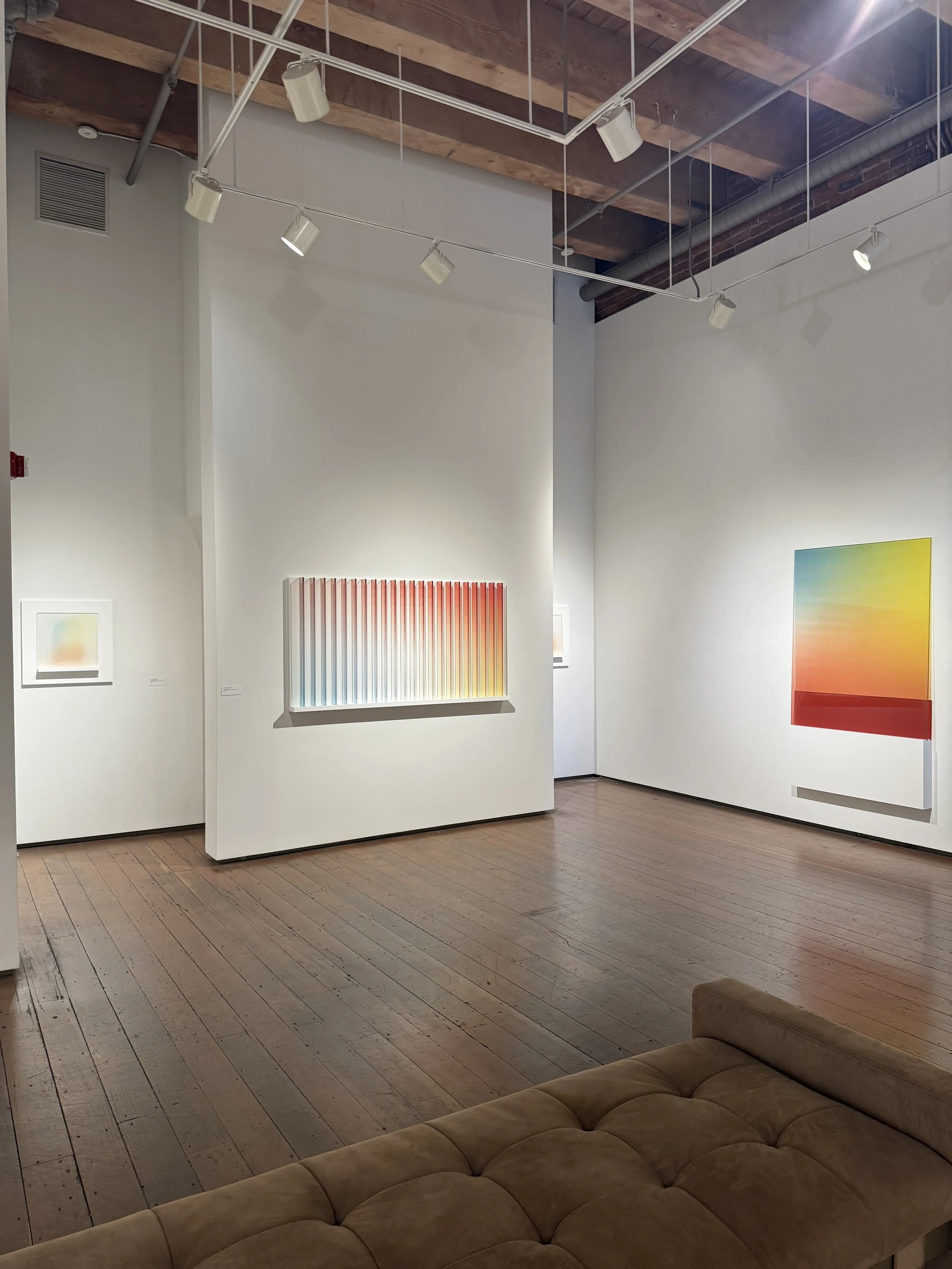
Installation view of if/the/yes/and at Greg Kucera Gallery. Image by the author.
The formulaic title told me most I needed to know about the attitude of the show: I expected precision. You know, coding? In the simplest way, you can use this formula in excel spreadsheets. I know Bruno’s work to be invested in color fields, creating immersive experiences through fabrication and programmed machines. You might have seen his installation at the Railspur Building in Pioneer Square: an exterior staircase encased in glass with a transparent rainbow filling the length of the space; each landing a new color experience in which to view the surrounding streets through. My personal favorite project of his occupied the Railspur building as well, a whole floor dedicated to an installation of gradient printed tents at Forest for the Trees in 2023, calling attention to the homelessness experienced in the PNW (and all sales of work donated to local mutual aid organizations helping the homeless).
This investigation of color and space continues in his newest body of work at Greg Kucera Gallery. It is a habit for me to get as close as possible to the work, and the Moiré patterns vibrating across the surfaces of Bruno’s works insinuated his fine details. I immediately thought of Sol Lewitt’s Wall Drawings, specifically one I experienced at Dia:Beacon in 2017. Lewitt’s work is actually just a plan on paper when a Museum acquires it; an entrusted team of draftsmen execute the drawing on the wall. Long lines in just three colors, red, yellow, and blue, extend for tens of feet, colors start and stop mid-stroke and change directions to create a hazy grid of squares in different hues. Walking up to it, the lines become clearer. Both Lewitt and Bruno rushed a memory to the front of my mind, of pressing my face into the tube TV I grew up with. I would slowly approach the screen and watch the color disintegrate into tiny dancing pixels, completely entranced by the visual noise wrapped around my eyeball until it became uncomfortable, or a parent pried me away from the screen.
Sol Lewitt at Dia Beacon.
Detail of Sol Lewitt at Dia Beacon.
Leaning in close to some of Bruno’s works, an array of plus signs burst in front of my eyes. Some disintegrated and pixelated into tiny squares. I wish the labels told me the approximate quantity of pixels composing the gradients. The tantalizing realization was finding it is also just three simple colors that are utilized: red, yellow, blue. In some instances, the edges of the mark created by the latex printer can be seen. Other times, they are entirely obliterated.

Detail of PLANAR STUDY : 1 (double), 2025. All photos provided by the author.
Bruno’s works are classified into two separate categories: PLANAR STUDY and INCIDENTAL WORK. The Planar Studies are all leaning acrylic panels, one has another slid behind it. I was looking up the materials in the middle of the gallery to understand how these were assembled. The pixels look like they are trapped between multiple layers of the acrylic. In my close and careful inspection, removing my fluorescent orange hat reflecting back to me to see clearer, I imagine it is a PET film backing to the panel (I had to look up PET film).

PLANAR STUDY : 1 (double), 2025 Latex print, PET film, acrylic, and acrylic-urethane on panel
72 x 44 x 4 inches.
Whether I am wrong or right, Bruno’s work executes the same wild spectrum of blue to red to yellow in a transparent manner, the pattern cascades onto the wall behind the works. In the case of INCIDENTAL WORK, the colors blend between multiple panels aligned inches apart.

INCIDENTAL WORK : 5, 2025 Latex print, PET film, acrylic, and acrylic-urethane on panel
37 x 37 x 4 inches.
While the spectrum is expansive to include greens and oranges, I did wonder, what if there were a purple present that made me say “that shade is everything?” Or, a real campy Magenta. I find contentment settling for these colors, and I am living for the execution of it. Writing this down I joke I am writing like this because it is Pride month.

INCIDENTAL WORK : 7, 2025 Latex print, PET film, acrylic, and acrylic-urethane on panel
11 x 56 x 8 inches.
Speaking of gay! The execution of the work is as methodical as neighboring artist Anthony White. White’s show Somethin’ Somethin’ in the front gallery of Greg Kucera houses his ornate and meticulously fabricated “paintings” made up of PLA (3-D plastic laid down line by line by White’s hand, through a 3-D printing pen). That meticulousness is harnessed in Bruno’s work in a much more meditative sense. Between the excessive iconography in White’s work, and Bruno’s layered processes, I was basically googling everything. The serenity of colors in if/then/yes/and became a reprieve from the cacophony of Somethin’ Somethin’.

Detail of CORDIAL COMPLIANCE, 2025 PLA on panel 60 x 48 inches.

CORDIAL COMPLIANCE, 2025 PLA on panel 60 x 48 inches.
Still, poetic parallels radiate between the two; they ride a wave of vibrancy and transcendence at opposite ends of a spectrum. White’s hand spun PLA “paintings” are as stringent as the more machine reliant works by Bruno. The intervention of the hand is a great point of contrast in the execution of the works—the more technology used the less presence the hand has. I’ve come back full circle to Lewitt’s Wall Drawings, who practically invented an ideology where “the hand” which executes the work doesn’t have to belong to the artist.
Installation shot of Bruno’s work at Greg Kucera Gallery.
Bruno’s work is truly unlike anything I’ve experienced once I started unpacking it all, analyzing material and processes to the best of my ability. There are moments of simplicity in the aesthetics that come across as monotonous —the color, the rectangularity— yet the craft is undeniably concise and meaningful. Certainly, there is an importance to the chosen palette that is familiar to printing processes, and are in a perfect triad relationship at equal distances from each other on the color wheel. While ambitious, the careful presentation is quite tame. The INCIDENTAL WORK are the most sculptural, yet restricted to the wall. The work is at risk at becoming empty to the less curious.
As material studies, these works are completely masterful. They fit in this context in the white walled highly polished setting of Kucera’s Gallery. Scaling up the work has frequently become a suggestion of mine and I don’t want to fall back on that suggestion, it is a result of knowing Bruno’s ability to take up space and create such an experience. Much like the artists conceptualizing color and light that precede him, Bruno and his work are so serious; I am craving drama.
Derek Bruno, thank you for making this work and giving my brain a colorful bath of thought.
These exhibits will be on view until June 28, 2025 at Greg Kucera Gallery. Do not miss them.